Himmelfarten
Editorial designHere are two books I've designed for John Grieg Forlag. And a self-published fanzine.
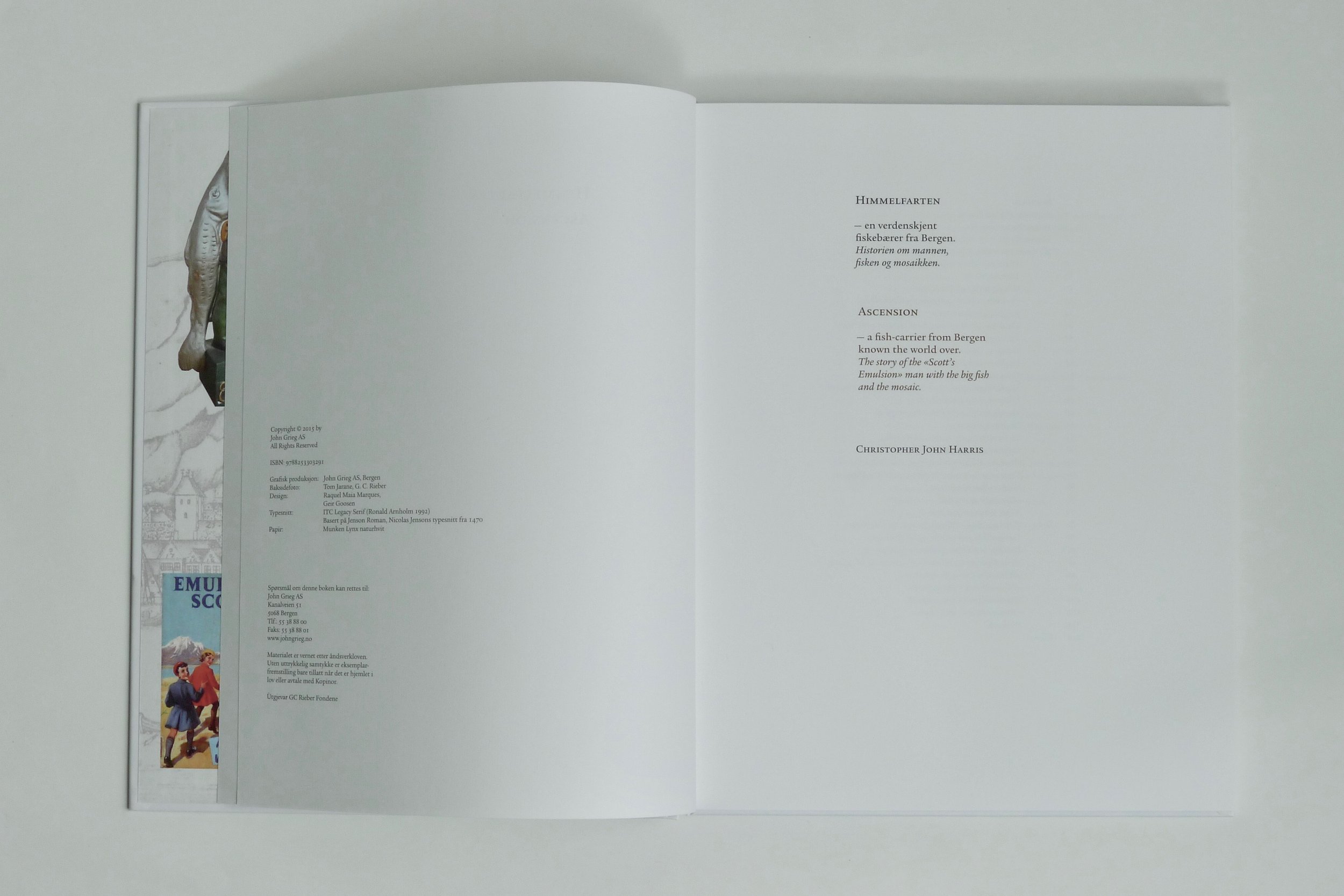
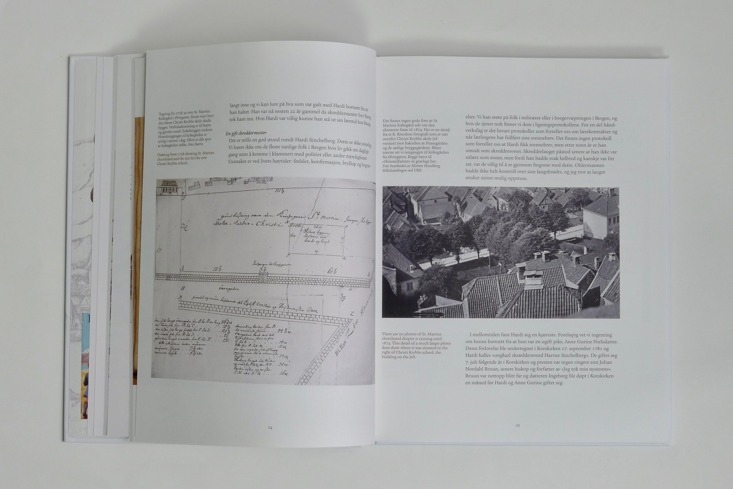
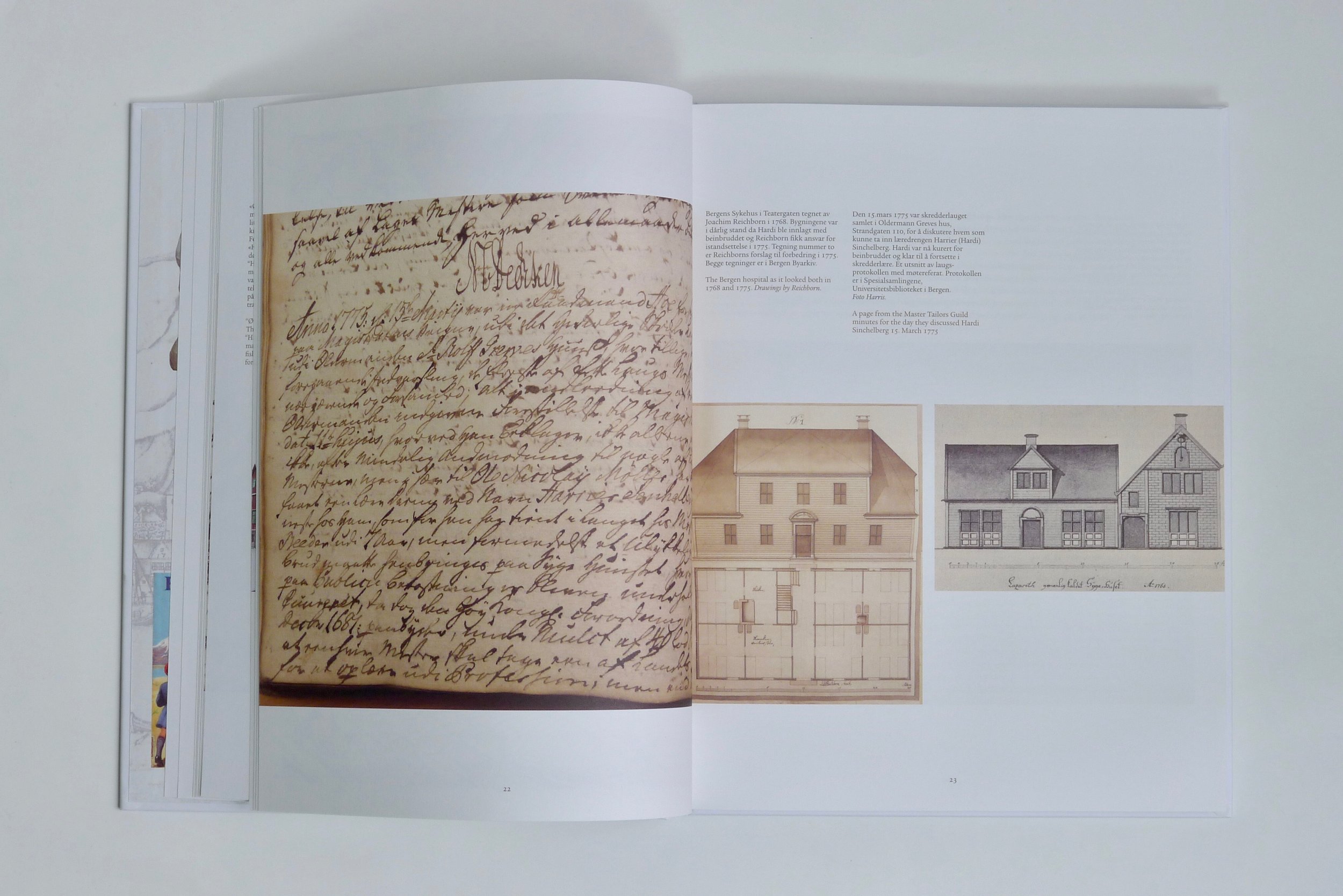
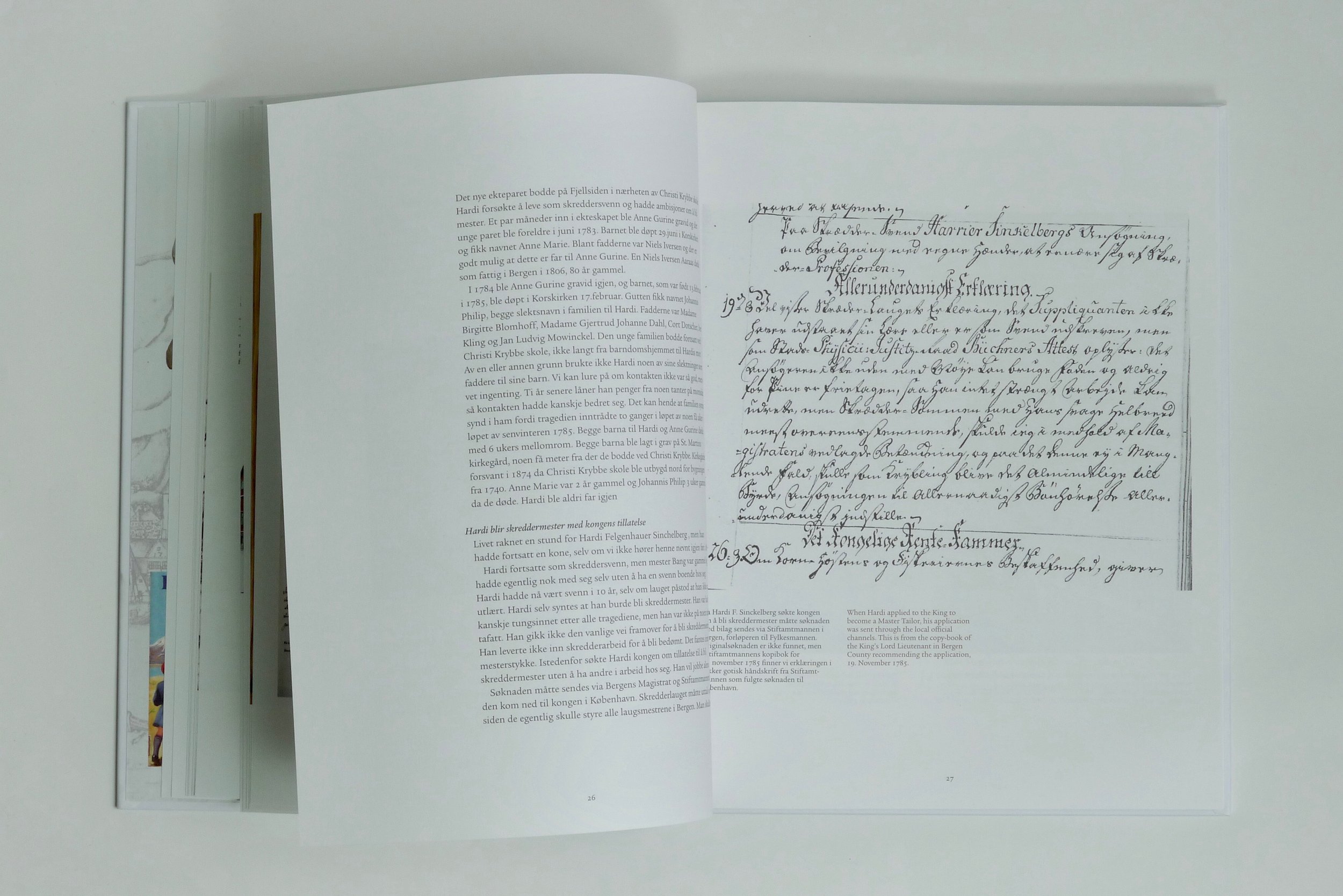
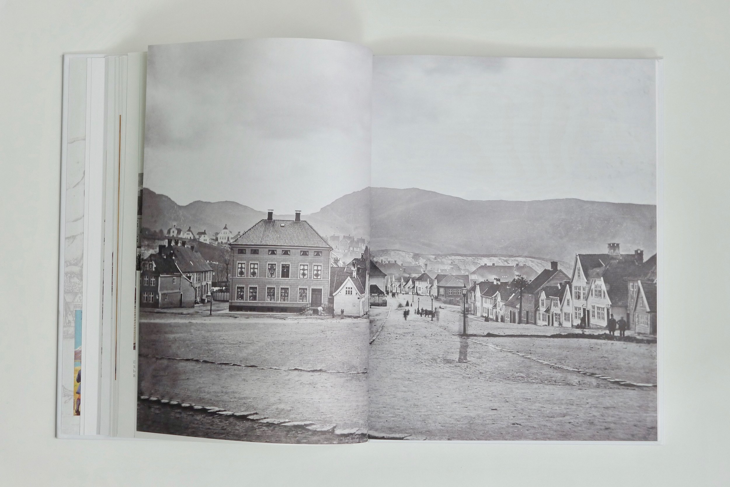
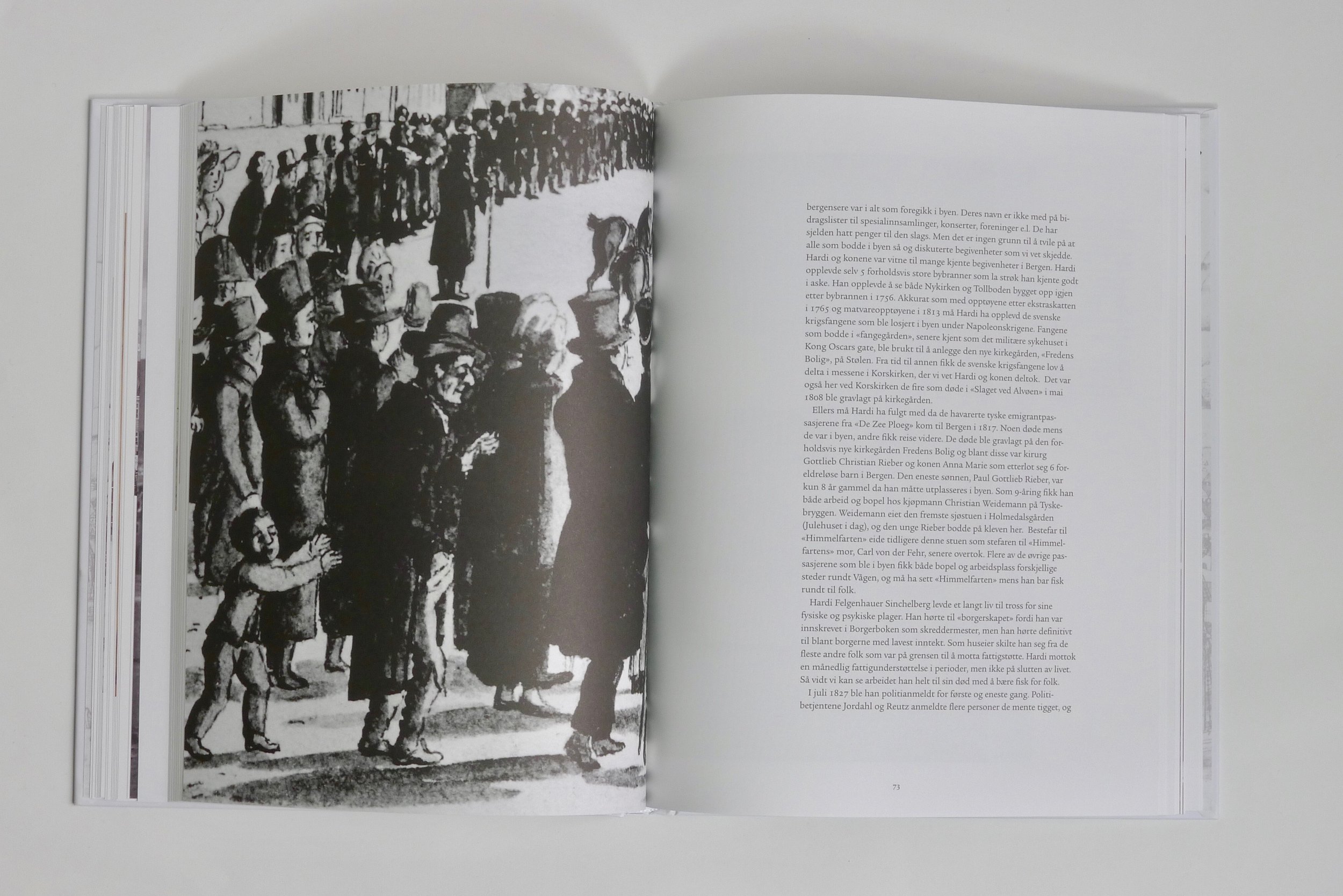
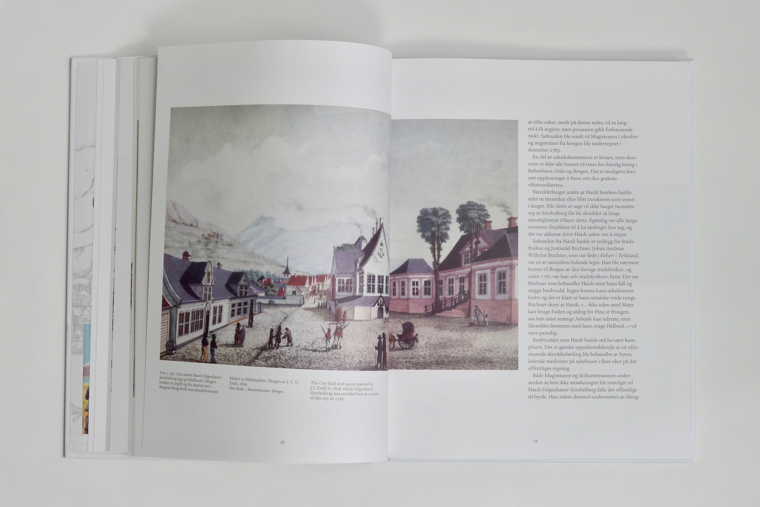
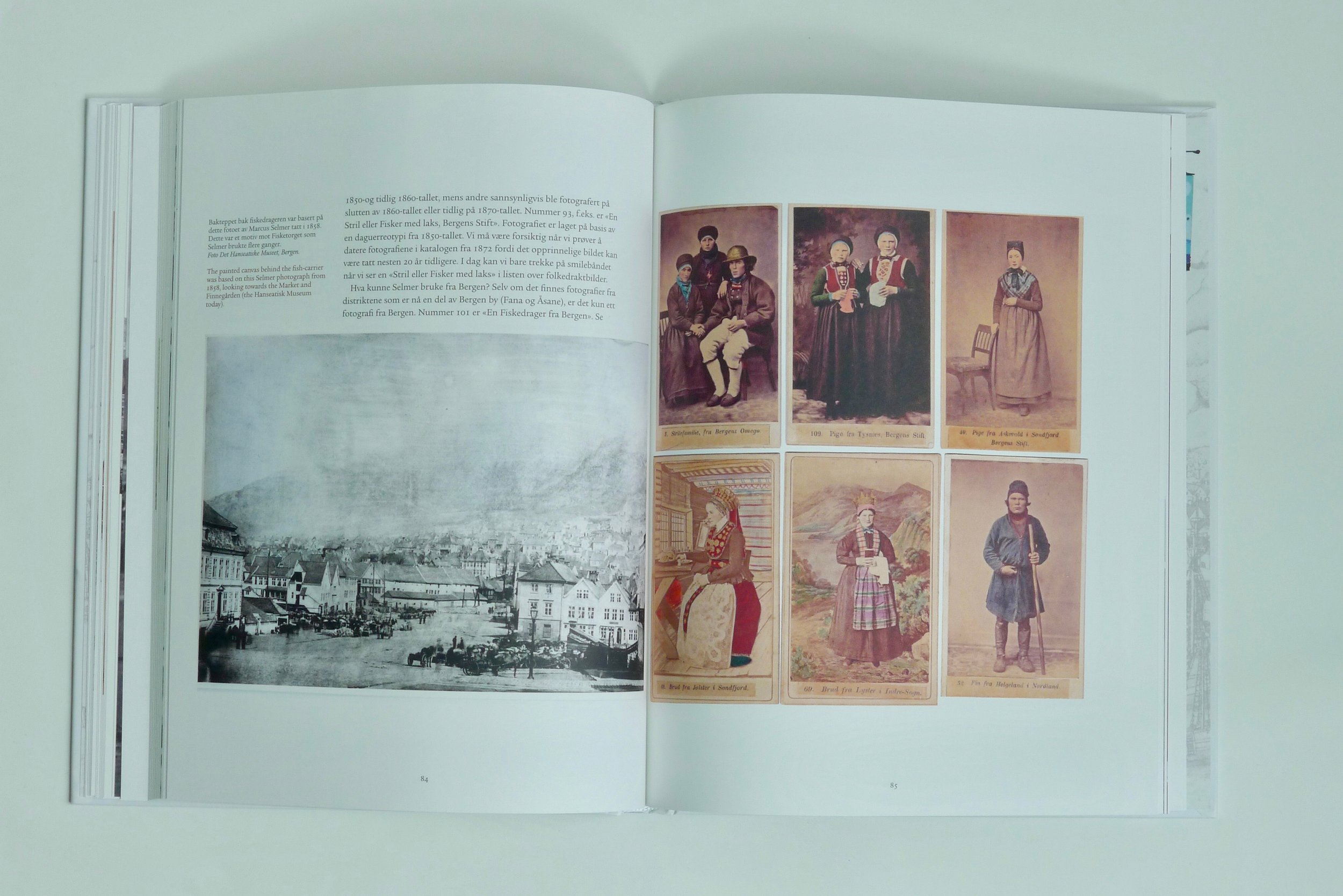
Norwegian title: Himmelfarten – en verdenskjent fiskebærer fra Bergen. Historien om mannen, fisken og mosaikken; english title Ascension—a fish-carrier from Bergen known the world over. The story of the “Scott’s Emulsion” man with the big fish and the mosaic; author: Christopher John Harris; publisher: John Grieg AS; language: Norwegian and English; design: Raquel Maia Marques; format: 220 x 280 mm; typeface: ITC Legacy Serif (Ronald Arnholm 1992), based on Jenson Roman, Nicolas Jensons typeface from 1470; paper: Munken Lynx; Year: 2015.
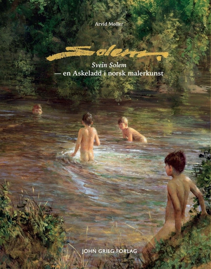
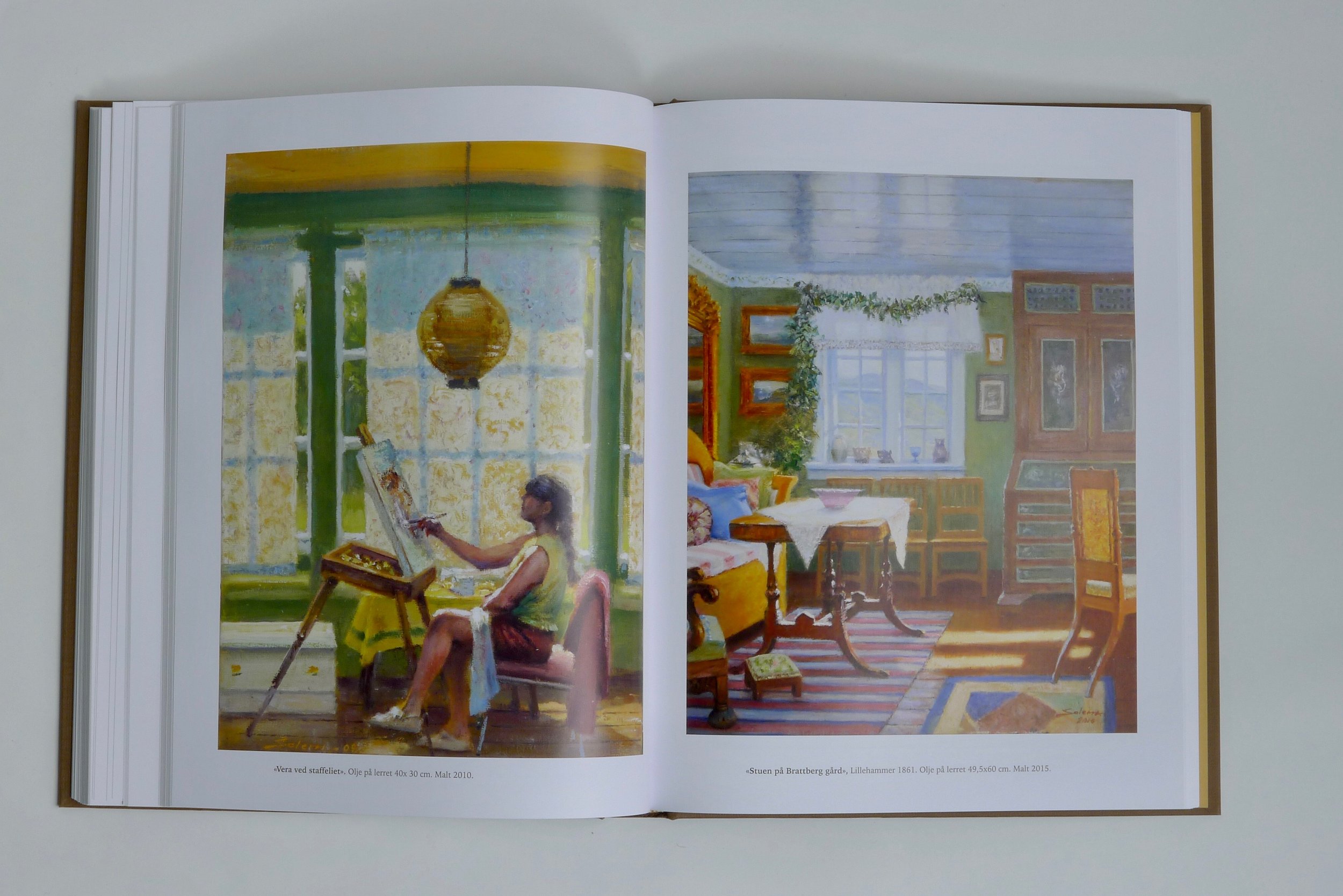
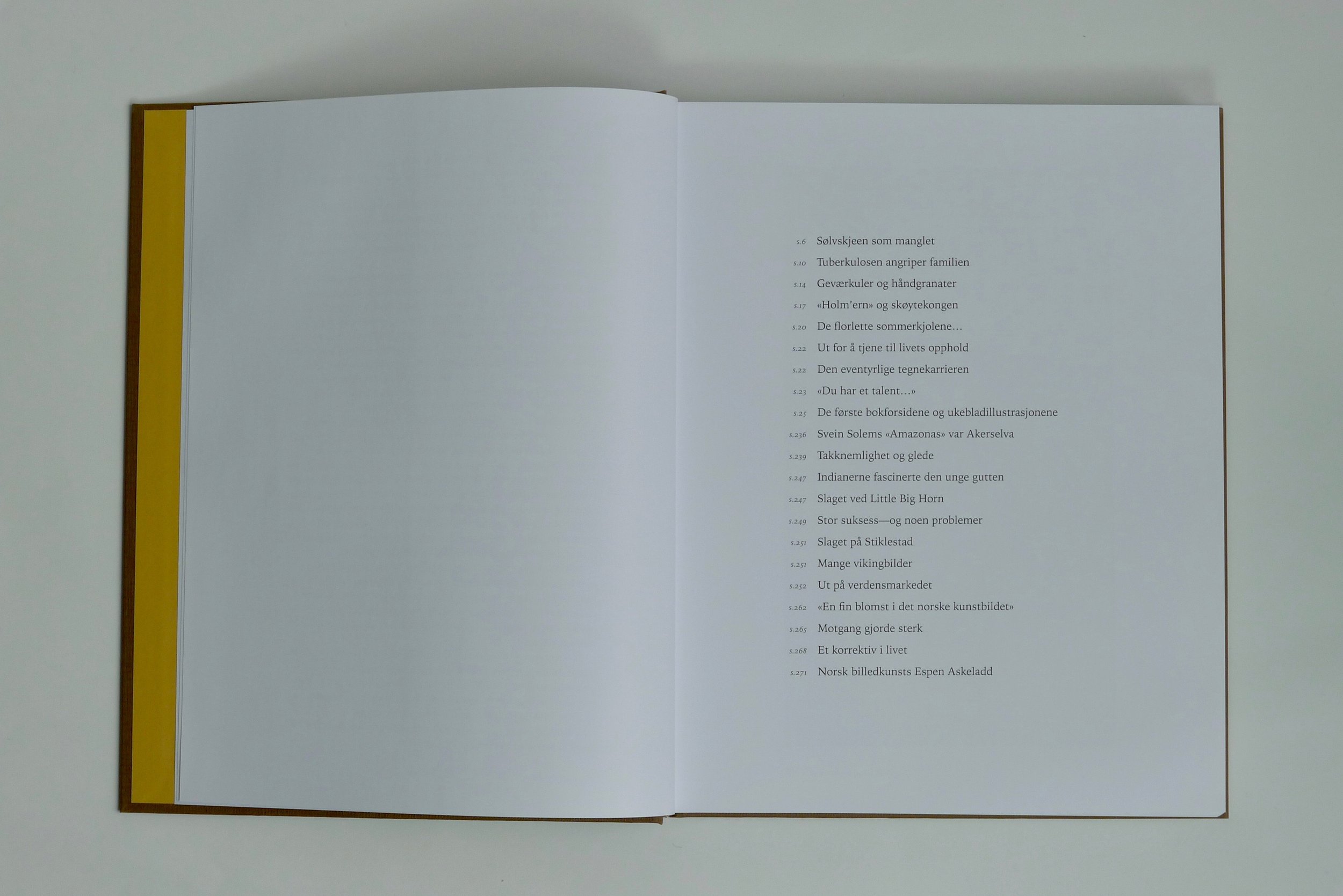
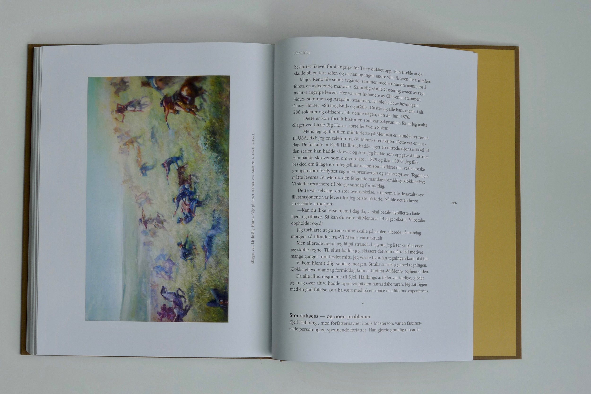
Svein Solem
Editorial designNorwegian title: Svein Solem – En Askeladd i norsk malerkunst; author: Arvid Møller; publisher: John Grieg AS; design: Raquel Maia Marques; language: Norwegian; typeface: Iowan Old Style; paper: Multi Art Silk; Year: 2016
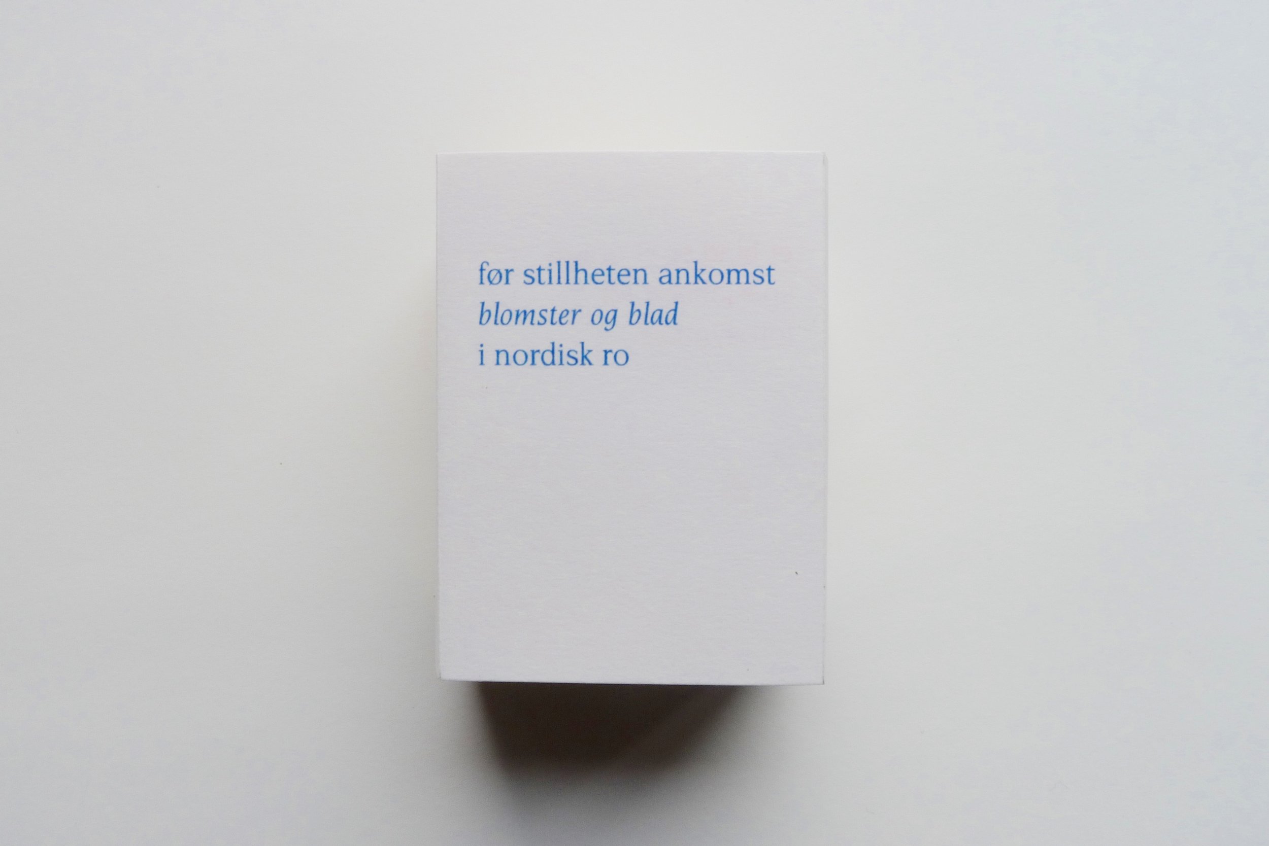
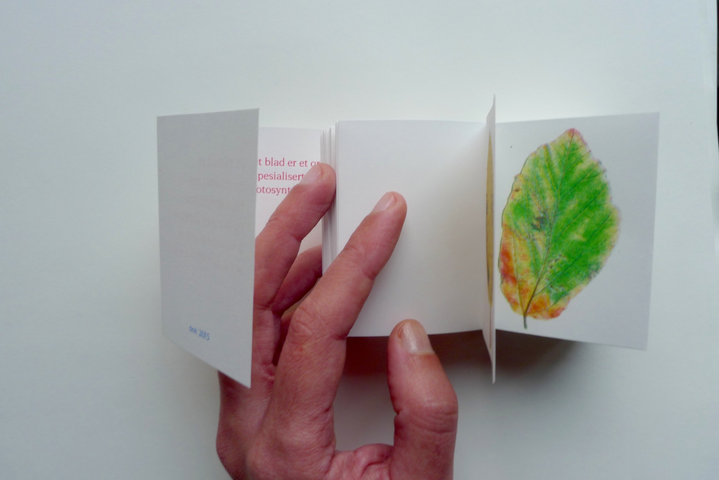
før stillheten ankomst
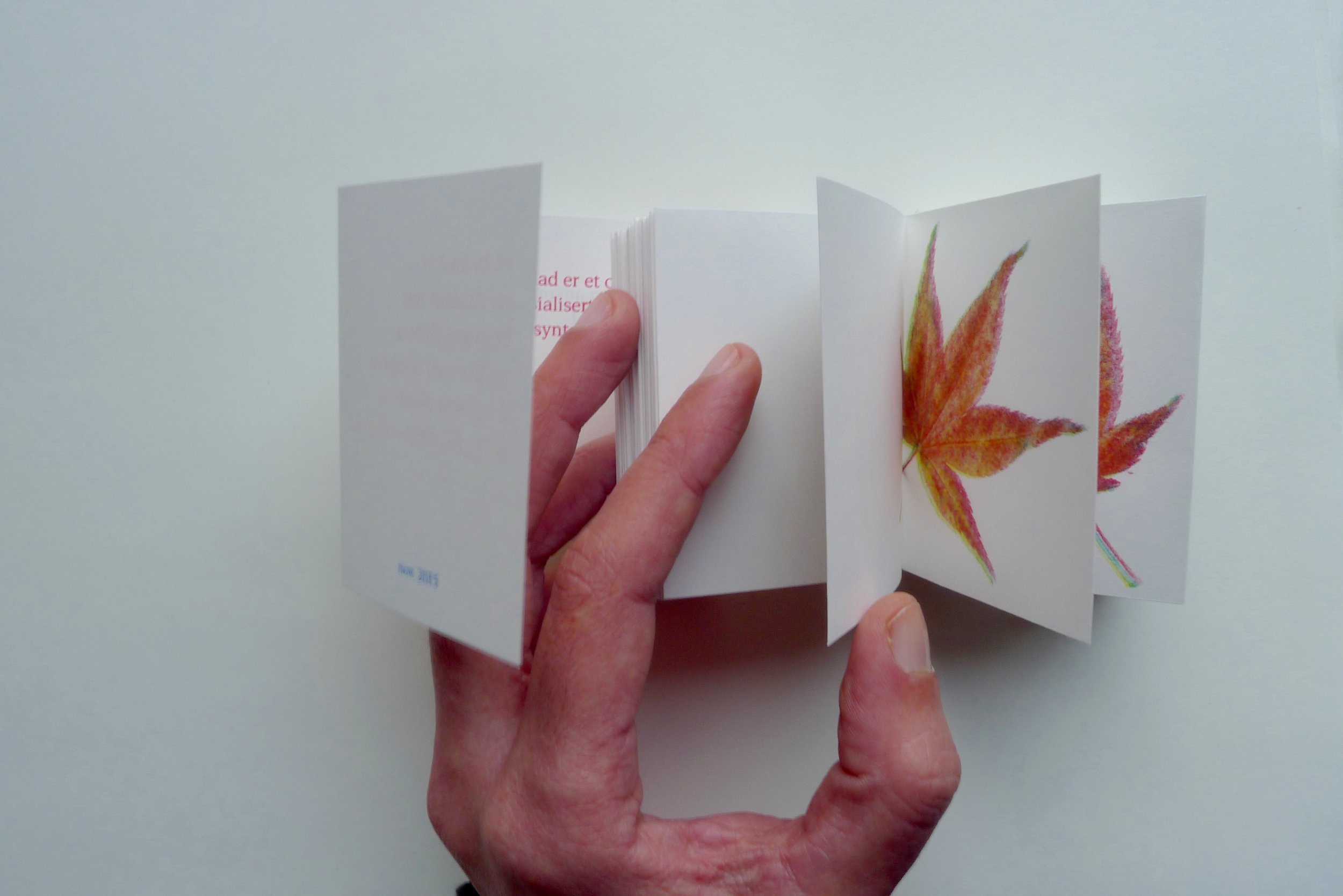
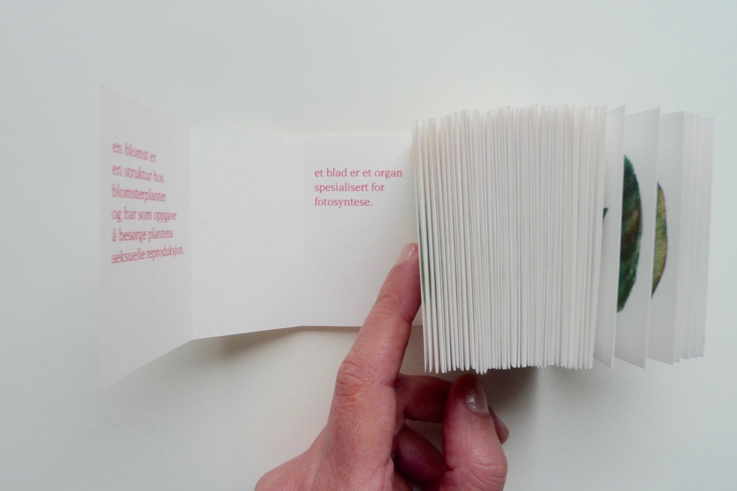
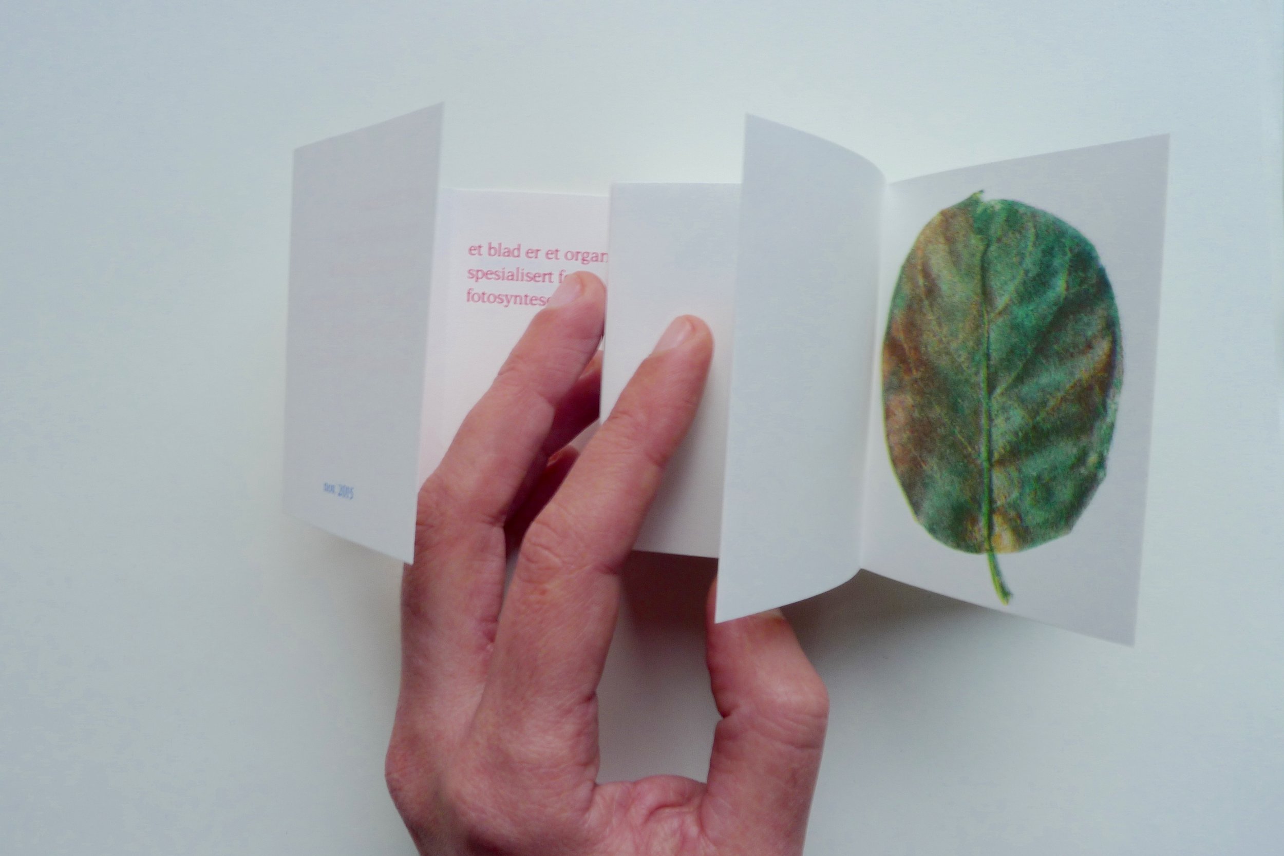
Self published Norwegian title: før stillheten ankomst blomster og blad i nordisk ro • Self-published • Format: 52 x 74 mm • Paper: cryogen white 120g (cover) + papyrus natural 80g (inside) • Pages: 129 • Typeface: Esperanto • Binding: double sided tape • Technique: Risograph printing 4 colors (yellow, red, blue and green) • Printer: Jessica Williams • Edition 30 • Year 2015.

